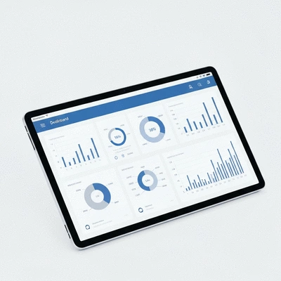
Data visualization is more than just pretty charts; it’s a powerful means of transforming complex data into actionable insights that can drive business decisions. By mastering the art of data presentation, you can significantly enhance clarity, engagement, and outcomes for your audience.
What You Will Learn
The significance of clarity in data presentation for effective decision-making.
Common pitfalls in data visualization and how to avoid them.
Techniques for using visual communication to enhance audience understanding.
Best practices for selecting the right chart types to convey your data effectively.
The importance of designing visuals with your audience's needs in mind.
Strategies for making your data visualizations accessible to all users.
How to leverage data storytelling to engage and inform your audience.
Tips for creating a readability and clarity checklist to improve your reports.
Key Practices for Enhanced Data Visualization
Transforming raw data into clear, actionable insights requires adherence to several best practices. The following visual highlights the essential "Do's" for effective data visualization, empowering better decision-making and audience engagement. For a deeper dive into the fundamentals, consider understanding data visualization basics.
Choose Right Chart Types
Use bar charts for comparisons, line charts for trends, and pie charts for proportions. Aligning data with the proper format enhances clarity.
✓ Bar charts for comparisons
✓ Line charts for trends
✓ Pie charts for proportions
Prioritize Clarity Over Clutter
Streamline visuals by eliminating unnecessary elements. Focus on key data points and use white space effectively.
✓ Limit color palette
✓ Use white space
✓ Emphasize critical data
Design for Your Audience
Tailor reports to specific audiences, whether executives or operational teams, considering their needs and technical proficiency.
✓ High-level for executives
✓ Detailed for operational teams
✓ Consider technical proficiency
Ensure Accessibility
Implement high color contrast, provide alt text for visuals, and design for assistive technology compatibility to include all users.
✓ High-contrast colors
✓ Alt text for visuals
✓ Assistive tech compatibility
Enhancing Business Reporting Through Effective Data Visualization
In today’s data-driven world, effective data visualization is essential for clear business reporting. At Analytics Ltd, I’ve seen firsthand how transforming raw data into visual formats can empower organizations to make informed decisions. Clear visuals not only simplify complex information but also help stakeholders quickly grasp key insights.
When data is presented clearly, it enhances decision-making processes and drives strategic initiatives. It's not just about displaying numbers; it's about telling a story that resonates with your audience.
Understanding the Importance of Clarity in Data Presentation
Clarity in data presentation is crucial. When reports lack clarity, they can lead to misunderstandings and misinterpretations, which may impact business outcomes. Data visualization should aim to convey information in a straightforward manner that highlights the main points without overwhelming the viewer. You can also explore understanding digital measurement plans to further enhance reporting effectiveness.
Facilitates quick decision-making
Reduces cognitive load for the audience
Enhances engagement with the report
By focusing on clarity, we ensure that our visual reports serve their purpose: to inform and guide business decisions effectively.
Identifying Common Pitfalls in Data Visualization
Even with the best intentions, many reports fall victim to common pitfalls that lead to cluttered visuals. One frequent mistake is overcomplicating visuals—too many colors, shapes, or data points can confuse the audience. Additionally, using inappropriate chart types can misrepresent the data, leading to inaccurate conclusions.
Overloading visuals with too much information
Choosing the wrong chart type for the data
Neglecting color choices that impact readability
Recognizing these pitfalls is the first step toward creating better data visualizations. At Analytics Ltd, we strive to aid our clients in avoiding these mistakes, ensuring that their reports are both effective and engaging.
Exploring Visual Communication Techniques
Visual communication techniques are vital for enhancing understanding. Techniques such as infographics and visual analytics can turn complex data into digestible content. By leveraging these methods, we can create visuals that not only inform but also captivate the audience.
Using infographics to summarize data points
Incorporating visual analytics to explore trends
Employing interactive elements to engage users
By incorporating these strategies, we elevate our reports, making them both informative and enjoyable to engage with. This creates a stronger connection between the data and the audience, ultimately driving better business outcomes.
Essential Best Practices for Data Visualization
Choosing the Right Chart Types for Your Data
When it comes to data visualization, selecting the right chart type is critical. Different types of data require different visual representations. For instance, a bar chart is ideal for comparing categories, while a line chart excels at showing trends over time.
Bar charts for comparisons
Line charts for trends
Pie charts for proportions
By aligning your data with the proper visualization format, you facilitate clearer communication and understanding of the information presented.
Prioritizing Clarity Over Clutter in Visuals
One of the key tenets of effective data visualization is prioritizing clarity over clutter. Streamlining visuals by eliminating unnecessary elements can dramatically improve readability. Focus on what truly matters—highlight key data points and remove distractions.
Limit color palette for consistency
Use white space to avoid overcrowding
Emphasize critical data points clearly
By making these adjustments, we enhance the viewer's ability to extract valuable insights without struggling through cluttered visuals.
Designing with Your Audience in Mind
Understanding your audience is paramount when designing data visualizations. Reports tailored for executives will differ significantly from those intended for operational teams. It's essential to consider their unique needs and expectations.
Executives may prefer high-level insights
Operational teams might need detailed data breakdowns
Consider the technical proficiency of your audience
By designing with your audience in mind, you ensure that your data resonates and serves its intended purpose. At Analytics Ltd, we focus on customizing reports to meet these varied requirements effectively.
Ensuring Accessibility in Data Visualization
Accessibility is a critical component of effective data visualization. Implementing features such as color contrast considerations and providing alt text can make your reports usable for a wider audience, including those with disabilities.
Use high-contrast colors for readability
Include alt text for all visuals
Design for assistive technology compatibility
By prioritizing accessibility, we not only comply with standards but also create a more inclusive environment for data interpretation.
Leveraging Data Storytelling to Engage Audiences
Data storytelling is an art that combines narrative techniques with data visualization. A compelling narrative around your data can engage the audience and drive home the significance of the findings. Crafting a story helps to contextualize the information, making it more relatable and understandable.
Use anecdotes to illustrate data points
Frame the data within a broader context
Highlight key takeaways succinctly
When we weave a story through our data, we transform reports from simple documents into powerful tools for communication and persuasion.
Utilizing Visual Hierarchy for Effective Communication
Creating a visual hierarchy in dashboards and reports is essential for guiding reader focus. By structuring information in a way that naturally leads the viewer's eye to the most critical elements, we enhance comprehension.
Use larger fonts for headings and key data
Organize content in logical sections
Implement contrasting colors to highlight important points
With a strong visual hierarchy, your reports will be easier to navigate, allowing the audience to digest information effectively. For insights into advanced analytical techniques that complement effective visualization, read our article on understanding advanced analytics techniques.
Incorporating Progressive Disclosure in Business Reports
Progressive disclosure is a technique that presents information in layers, allowing the audience to access more detailed data as needed. This approach is beneficial when dealing with complex data sets that may overwhelm viewers if presented all at once.
Start with high-level summaries
Allow deeper dives into specific data points as needed
Encourage audience exploration of the data
This method not only keeps the audience engaged but also makes it easier to manage the complexity of the data presented.
Implementing a Do's and Don'ts Framework for Visualization
Having a clear framework for visualizations can help ensure effective communication. Here are some do's and don'ts to consider:
Do: Use clear labels and legends
Don't: Overuse color or effects that distract
Do: Ensure charts and graphs are easy to interpret
Don't: Use jargon that may confuse the audience
By adhering to these guidelines, we can significantly enhance the clarity of our visual reports.
Creating a Readability and Clarity Checklist
Lastly, a readability and clarity checklist can serve as a practical tool to evaluate our data visualizations. Here are some key elements to include:
Are key insights highlighted clearly?
Is the text legible against the background?
Are visuals free of unnecessary clutter?
Using this checklist will help ensure that our reports maintain a high standard of readability and clarity, ultimately leading to better business reporting.
Pro Tip
To enhance your data visualizations, consider incorporating user feedback into your design process. Regularly soliciting input from your audience can help you identify what works and what doesn’t, allowing you to refine your visuals for better engagement and understanding.
Frequently Asked Questions About Data Visualization
What is data visualization?
Data visualization is the graphical representation of information and data. By using visual elements like charts, graphs, and maps, data visualization tools provide an accessible way to see and understand trends, outliers, and patterns in data.
Why is clarity important in data presentation?
Clarity in data presentation is crucial because it facilitates quick decision-making, reduces cognitive load for the audience, and enhances engagement with the report. Unclear presentations can lead to misunderstandings and misinterpretations, impacting business outcomes.
What are common pitfalls to avoid in data visualization?
Common pitfalls include overloading visuals with too much information (clutter), choosing the wrong chart type for the specific data, and neglecting color choices that can impact readability and accessibility.
How can I make my data visualizations accessible?
To ensure accessibility, use high-contrast colors for readability, provide alt text for all visuals, and design for compatibility with assistive technologies. This ensures that your reports are usable by a wider audience, including those with disabilities.
What is data storytelling?
Data storytelling is the art of combining narrative techniques with data visualization to create a compelling story around your data. It helps contextualize information, making it more relatable, understandable, and impactful for the audience.
Summarizing Data Visualization Best Practices
As we wrap up our discussion on data visualization best practices, it's essential to highlight the key takeaways that can significantly enhance your business reporting. Effective data visualization not only clarifies complex information but also boosts decision-making by presenting insights in an accessible manner. By applying these best practices, you can transform your reports into powerful tools that drive strategic actions.
Remember, the goal is to create visuals that not only inform but also engage your audience. When implemented correctly, these techniques can lead to clearer communication and better business outcomes.
Encouraging Continuous Improvement in Reporting Practices
In the rapidly changing world of business, continuous improvement in reporting practices is vital. I urge you to regularly assess and refine your data visualization techniques. This is not just about keeping up with trends but also understanding the evolving needs of your audience.
Schedule regular reviews of your reports
Solicit feedback from stakeholders
Stay updated with new visualization tools and techniques
By committing to this process, you ensure that your reporting practices remain relevant and effective, ultimately driving better engagement and decision-making within your organization.
Utilizing Reporting Tools for Enhanced Data Presentation
In today’s digital landscape, leveraging powerful reporting tools can significantly enhance your data visualization and business reporting. Tools like Tableau and Power BI offer user-friendly interfaces and robust functionalities that allow for dynamic visual presentations.
Tableau: Excellent for creating interactive dashboards that offer real-time data insights.
Power BI: Ideal for integrating with other Microsoft products, providing seamless access to your data.
Google Data Studio: A free tool that enables quick setups and collaborative reporting.
Utilizing these tools can not only save time but also enhance the clarity of your visualizations, making your reports more impactful and informative.
Call to Action: Implementing These Practices in Your Reports
Now that we've explored these best practices, I encourage you to take immediate steps in applying them to your next reporting cycle! Start small by making one or two changes, such as selecting the right chart type for your data or ensuring clarity over clutter in your visuals.
At Analytics Ltd, we’re committed to helping you enhance your data-driven decisions. By embracing these practices, you're not just improving your reports; you’re empowering your organization to thrive in a data-centric world!
Recap of Key Points
Here is a quick recap of the important points discussed in the article:
Effective data visualization clarifies complex information and enhances decision-making.
Prioritize clarity over clutter by limiting color palettes and using white space.
Choose appropriate chart types for data representation to facilitate understanding.
Design with your audience in mind, tailoring reports to their specific needs.
Ensure accessibility in data visualizations by considering color contrast and providing alt text.
Leverage data storytelling to create engaging narratives that resonate with your audience.
Utilize visual hierarchy to guide focus and improve comprehension of reports.
Incorporate progressive disclosure to manage complexity and keep the audience engaged.
Implement a do's and don'ts framework to enhance clarity in visualizations.
Regularly review and refine reporting practices to stay relevant and effective.
Your go-to resource for transforming raw digital traffic into actionable business intelligence. We help enterprises with data engineering, advanced analytics, and continuous optimization.
Trusted by product managers, marketers, and executives, our mission is to provide reliable, easy-to-follow insights backed by technical precision and strategic consultation.


