
Charts
Simple representations of individual datasets (e.g., bar chart for sales over time).
Get Avery Jordan's latest insights directly to your inbox and transform your digital strategy.
Posted on: 2026-05-19
By: Avery Jordan
What if the way you present data could transform how your audience perceives it? Data visualization is not just about aesthetics; it's about making complex information understandable and actionable.
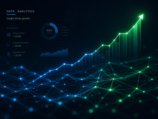
This visual highlights the core concepts of data visualization and its benefits, offering a clear distinction between charts, graphs, and dashboards, and underscoring the importance of visual storytelling.
The art and science of representing data visually, making complex information easier to understand through graphical elements.
Simple representations of individual datasets (e.g., bar chart for sales over time).
Depict relationships between multiple datasets (e.g., line graph for growth trends).
Comprehensive overview of multiple visualizations on a single screen.
Adds a narrative layer to visuals, guiding the viewer through information and making complex data digestible.
Accessible options for experimenting and creating visualizations, fostering community learning:
Data visualization is the art and science of representing data visually, making complex information easier to understand. By using graphical elements like charts, graphs, and maps, data visualization aims to communicate insights effectively and efficiently. At Analytics Ltd, we believe that when data is displayed visually, it allows for quicker comprehension and can highlight trends that would otherwise be hidden in raw numbers. For a comprehensive introduction to this topic, you can explore resources from Digital.gov.
The primary purpose of data visualization is to transform data into a visual context, enabling businesses to make informed decisions quickly. This transformation is crucial in today’s fast-paced digital landscape, where the ability to interpret data quickly can lead to a competitive edge.
In its essence, data visualization is about storytelling through data. As we sift through layers of information, the right visualizations help us extract valuable insights. They bring numbers to life, translating them into visuals that resonate with stakeholders. This visual storytelling is a key component of how we approach analytics at Analytics Ltd.
By effectively utilizing data visualization, we can bridge the gap between complex datasets and actionable insights. When clients see their data in a visual format, it becomes easier to engage and understand the implications of their numbers.
Understanding the differences and relationships between charts, graphs, and dashboards is essential for effective data visualization. Charts represent a single data set, while graphs can depict relationships between multiple datasets. For example, a bar chart may show sales over time, while a line graph might illustrate growth trends.
Dashboards, on the other hand, act as a comprehensive overview of multiple visualizations on a single screen, offering a holistic view of key metrics. These tools are vital for executives and managers to monitor performance at a glance. At Analytics Ltd, we often create tailored dashboards that aggregate critical metrics and provide a single source of truth for our clients.
This clear differentiation helps organizations choose the right tools for their specific data presentation needs. For more on effective design principles in data visualization, a guide from Johns Hopkins University Library offers valuable insights.
Visual representations of data are crucial for identifying trends and patterns that might be missed in spreadsheets or tables. By presenting data visually, you can quickly draw conclusions that might take much longer to ascertain through traditional methods. For instance, spotting a downward trend in sales is far easier when represented in a graph than in a list of numbers.
Moreover, engaging visuals foster deeper understanding among diverse audiences, including those without a technical background. This inclusivity is one of the reasons why I’m passionate about data visualization—everyone deserves to understand the stories their data tells!
Data storytelling enhances the impact of visual representations by adding a narrative layer to the data. When we craft visualizations at Analytics Ltd, we consider the story that needs to be told, not just the data points. This narrative helps guide the viewer through the information, making complex data more digestible.
By weaving a narrative around the visuals, we can highlight critical insights and ensure that the audience grasps the implications of the data. This approach not only enhances understanding but also encourages stakeholders to act on the insights presented. The importance of clear and concise data presentation is further emphasized in research available on PMC (PubMed Central).
Ultimately, effective data storytelling transforms numbers into a compelling narrative, driving home the importance of why the data matters.
To take your data visualization skills to the next level, focus on the principle of design simplicity. Strive for clarity by minimizing clutter—use whitespace effectively and choose colors that enhance rather than distract from your data. A well-designed visualization not only conveys information but also invites your audience to engage with the story behind the data.
Data visualization is more than just a buzzword; it’s a powerful tool that transforms complex data into easily digestible insights. By presenting data visually, we can uncover hidden patterns and trends that might go unnoticed in raw numbers. This transformation enhances comprehension, enabling professionals to make informed decisions quickly.
When companies like Analytics Ltd utilize data visualization effectively, they can streamline their decision-making processes and identify growth opportunities. It’s crucial for organizations to adopt data visualization not just as a practice but as a culture within their teams.
Ultimately, the impact of data visualization extends beyond aesthetics—it fosters a data-driven culture that promotes continuous improvement and innovation within organizations.
Now that you understand the significant benefits of data visualization, it’s time to take the next step! I encourage you to explore various tools and start creating your own visualizations. Don't hesitate to dive into the rich world of data visualization—it's a skill that's becoming increasingly vital in every industry.
To help you get started, here are some valuable resources and tools that can assist you in your journey:
For those on a budget or looking to experiment with their visualizations, open-source software can be a fantastic option. Here are a few popular tools that I recommend:
These tools not only offer powerful capabilities but also foster a community of users who share tips and tricks, making the learning experience even more valuable. So, take the plunge and start creating—your data deserves to be seen!
Here is a quick recap of the important points discussed in the article:


